Identity: Summing myself up in a glyph

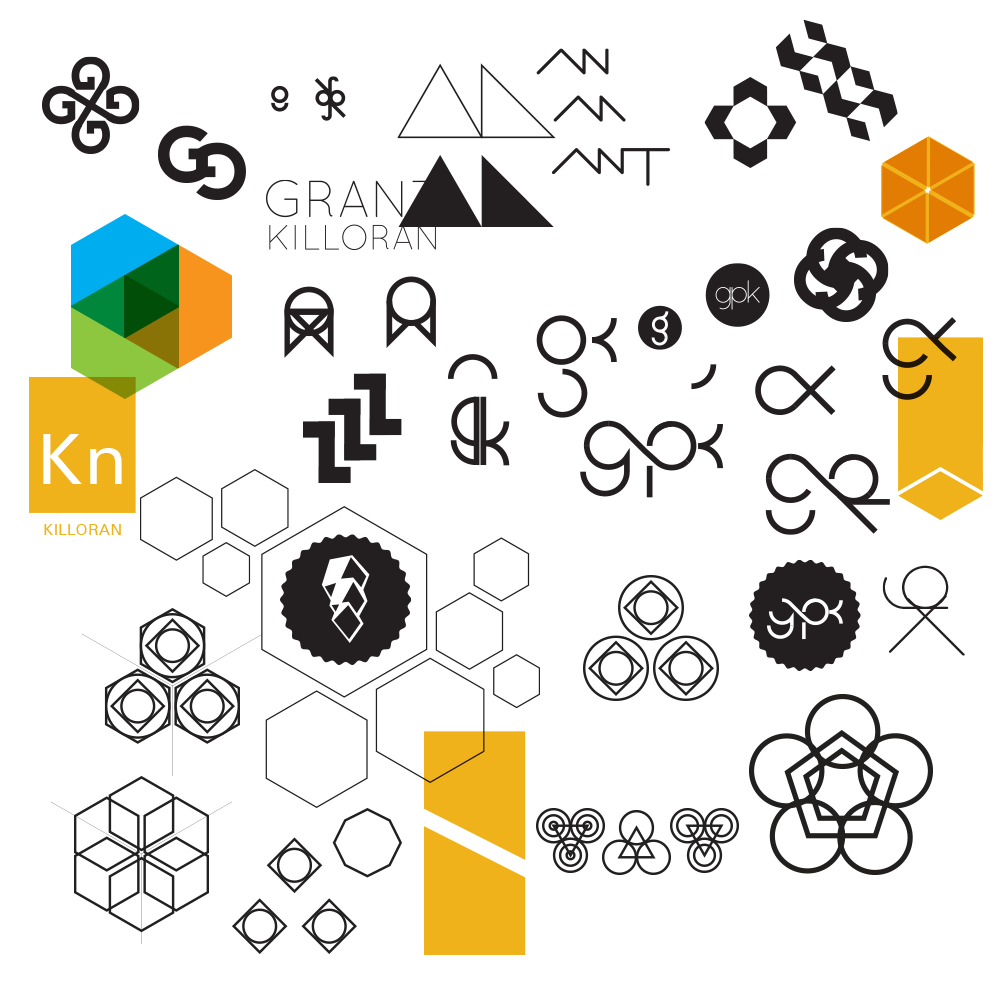
One of our early uni projects was to come up with a brand identity for ourselves - what a great idea for a project! Looking back on it, this was probably one of the most relevant projects we actually ever had...but I digress! If you have a gander below, you'll see the wild swings my ideas took, purely in complete panic over how the heck I was going to come up with a concise identity for myself. I think the final work for the unit wasn't actually my finished logo as it appears today - that took some further thought and dabbling.

Image

Inspiration

You can see the inspiration I took from Japanese mon - Japanese design and culture is deeply intriguing to me. I'm also a big fan of ambigrams, so thought it'd be epic to incorporate that into my identity - but that didn't really work out!

You can see my 'throw it all at the wall and see what sticks' approach to Illustrator files with this image. I doodle and iterate and throw bits and bobs around until something vaguely interesting happens.

The end result

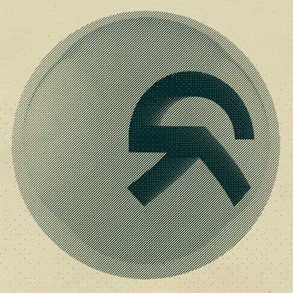
Eventually I managed to throw together my initials in a format that looked kinda cool! A sideways G merging into a K looks like a glyph/character from an alien alphabet! Which is totally up my alleyway. Since that point, I've been slapping it on all sorts of things I've made - Kim even had a wax stamp made for me!

Image

Image